Monday, March 2, 2015

Vintique Flea Market

There is a new antique market in town and its called Vintique. Vintique is a combination of the words vintage and antique which was very fitting for this smallish market held at Silver Street Studios in the Washington area this past weekend. Silver Street is a newer warehouse area that is rentable for events and such. Its a great venue and they even had food trucks come. 

There were about 30 vendors there. I went on Sunday afternoon though, and since the event was all weekend, a lot of stuff seemed picked over. They did have a few really great pieces. Prices varied from good deals to pretty expensive. I didn't find anything, but its worth a trip the next time they have it. Admission is free, but they ask you make a donation to an animal shelter. 

http://www.vintiqueflea.com

Standing at the entrance. 


Pretty doors! 


I loved this over sized basket tray to hang on a wall or go on an over sized coffee table or island. 


I fell in love with this marble top piece. So beautiful! 


And, I loved this little chest. It would be so cute as a bedside table or next to a chair in a living room.


 I just thought this was a pretty set up with the Louis Philippe mirror and the antique lamps. I love when antique lamps have lucite bases. The combination of antique and modern gets me so excited. Call me a decor nerd. 


I am not sure when the next Vintique Market is, but it is worth an hour of your time. 

Thursday, February 26, 2015

Design Boards for Client's Townhouse

I don't have after pictures for this client's home yet, so the design boards will have to do. This client bought a new townhouse and wanted help with the living room, dining room, and master bedroom. They didn't have a huge budget for getting three rooms done so I had to be resourceful. 

Living Room

We spent most of the money in this room on the sofa which is from High Fashion Home. It's always worth it to spend more on a high quality couch. The coffee table, both end tables, and the chairs are from Overstock.com. The white chair side table/stool is from One Kings Lane as is the orchid for the coffee table. The lamps are from Wayfair, and the rug is from Home Decorators Collection. 


Dining Room

The dining room table, side chairs, and end chairs are all from Cost Plus World Market. They have some great stuff in there. The mirror is from a wholesaler called Park Hill. It is huge and makes a big statement. The chandelier is from Shades of Light and the two urn/moss balls are from One Kings Lane. They make great table centerpieces! 


Master Bedroom

The bed is from One Kings Lane. The dresser, bedside tables, and bedside lamps are from Pier 1 Imports. The two wicker trunks at the foot of the bed are from IKEA, and are a great find if I do say so myself. :) There are those two Stately Crystal Table Lamps from Overstock again that I used in the previous post. They already had the gray chair which went perfectly in the space. The magazine holder is from Wisteria, and the side table is from Crate and Barrel. 


Client Master Bedroom Update

I just finished a client's master bedroom update. She wanted to lighten the space up without painting, buying new bedroom furniture, or spending a ton of money. 

Here are a couple BEFORE pictures. The walls, bedding, carpet, and lamps were all in the same beige color family which caused the room to look a little washed out. A lot of people make this mistake because they simply don't know where to add color, or are afraid of color in general. 


Here is her design board. 


And, here are some AFTER pictures. The bedding is from Pottery Barn and is a light cream and blue color. The coverlet and shams are a satin to add a different texture and shine. Plus, she has a cat and satin is great for cat hair!


The bench is from Wayfair and was a pretty good deal. I wanted to add tufting somewhere in the room and this was a perfect place to do it. 


I just adore these botanicals from Restoration Baby and Child. Most botanicals you will find are rather expensive. These, at just $99 each, are a steal. RH Baby and Child has a lot of great items for cheaper that don't look childish at all. I especially love their sconces and mirrors. These add interest and fill the space above the bed beautifully. 


These crystal table lamps are from Overstock.com and are also a great deal. She needed something tall and skinny since her bedside tables aren't huge. The white lamp shades also help lighten up the space quite a bit. 


What a lovely transformation without spending an arm and a leg. Little changes can often times equal big results! 

Monday, July 21, 2014

How To: Gallery Wall

Since moving into our house less than a year and a half ago there have been many projects on my to do list that have yet to get done. One of those items was to hang a gallery wall of photographs in our master bedroom, and this past weekend I finally spent the time doing so. I didn't want this to be an expensive project, so I headed to Marshall's HomeGoods, and was able to find a lot of really great frames on the cheap. 

STEP 1: Buy frames in a variety of sizes, materials, and colors but make sure that they all blend together well. It's good to have two or three big frames to be able to build around. Also, don't buy too many small frames. As a point of reference, my smallest frame below (bottom left) fits a 5x7 photo, and I only used one of those. Buy more than you think you will need and take back what you don't end up using. I ended up taking back five frames.

STEP 2: Lay out the frames on the floor exactly how you want them to hang on the wall. Play around with it. I had many trial and errors before finally landing on the one below. 

*Disclaimer - please excuse the poor iPhone 4 photo quality. I desperately need a new phone! 


STEP 3: Use construction paper, or in my case the paper the frames were wrapped in at the store, and trace the size of each frame on the paper. Be as exact as possible. Then cut. Measure the center of the wall in which you are hanging the gallery wall as a point of reference. Start with your biggest frames first and start taping the paper to the wall. 

STEP 4: Once you are satisfied and have measured where the brackets are on the back of each frame, hammer nails directly into the paper. Hang the picture to make sure its covering the paper entirely. Remover paper.


And voila! You have a fabulous photo gallery. I chose to use mainly artistic photos that were taken either on our wedding day or at our engagement session to make it more visually appealing. I also chose to print them all in black and white (with an exception of my bridal portrait) to make it more uniform.  Project total cost? Less than $200. Not bad if you compare it to a 3x7 piece of art! 


A note about HomeGoods: I seriously love that place! There are some awesome finds in there. A lot of junk, yes, but you can really find some good frames, lamps, decorative accessories, pillows, rugs etc. Below are a couple close up shots of some of the frames. 


Sunday, July 20, 2014

Give Your Bookshelves a Facelift

I recently took a designer bookshelf styling class and learned so much. I have always wanted to have beautiful bookshelves, but for some reason always felt really blah about my shelves. We have built in bookshelves in our living room, so after taking this class I was inspired to give my shelves a little facelift if you will. 

I often times ooh and ahh over bookshelves like below on pinterest. 


And this. It seems so simple, but it way harder than it looks.


Let me share a few key tips I learned from taking the styling class. 

  1.  Use small prints and art pieces on your shelves. It helps in achieving the layered look that make shelves look so "designed". Use an easel to display them.
  2.  Look for a variety of different objects to purchase.
  3. Double the quantity of items you think you need because bookshelves take way more items than previously thought.
  4. Use books!! Add a variety of book heights and sizes, but be sure not to use more than three book styles (antique books, coffee table books etc.)
  5. Look for consistency in the color of your objects. It's best to stay in the three to four color range. 


Our teacher, Amitha, demonstrating a bookshelf design. So beautiful. 


Now, here is my blank slate. Right after we first moved in I painted the back of the shelves in Restoration Hardware's "slate" paint. It's a really beautiful gray. 


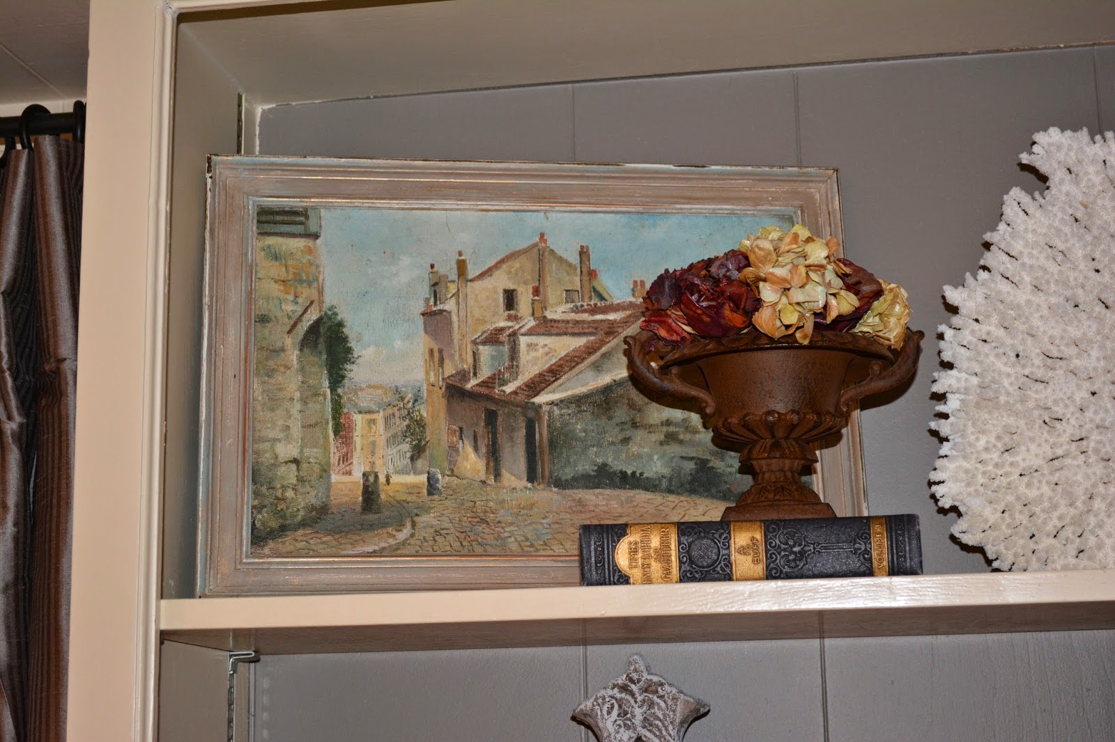
Here is my final product. It is a mix of accessories I already had and new ones I bought after the class. I love to use antique items whenever I can. 


 Some items to think about placing in your bookshelves are below.

  • Books
  • Baskets
  • Coral and Shells
  • Boxes
  • Small Prints and Artwork
  • Vases
  • Crosses
  • Picture Frames
  • Jugs
  • Crowns
  • Statues
  • Pedestals
  • Urns
  • Small Topiaries
  • Flowers
  • Trophies
  • Platters
  • Plates
  • Pitchers
  • Candles
  • Bowls
  • Architectural Accents
  • Globes
  • Clocks
  • Small Mirrors
Happy Bookshelf Styling! 


Wednesday, June 11, 2014

Fantastic Builder Home Tour

About a month ago I toured one the most amazing homes I have ever seen.  This builder model home in  Piney Point is over 10,000 square feet and gorgeous. The finishes were mostly antique, and the number of antique doors that were repurposed made me drool. It was furnished by all my favorite stores around Houston, MAI, Village Antiques, Back Row Antiques, Three Doors, Boxwoods etc. This house can be yours for the price of 5.5 million dollars. 


I love the boxwood topiaries in those giant planters. So gorgeous!


A new trend I have been seeing around town are these gravel driveways and walkways. I wasn't sure how I felt about them at first, but they have been growing on me, and in fact, I am even learning to like them. 


The entry was was breath taking. I love a well done entry. It is the first thing people see when they come over, so I think it's well worth the money when decorating a house. 


Other side of the entry.


Off the entry to the left was an awesome study/office. Love these built ins. 


The builder used stone throughout the house. It's a little touch of Austin in a rather European house.


I just loved this room. This was also off the entry way and the room's sole purpose is for entertainment. 


The foyer off of the entry way. Whoops, finger over the lens. 


Right off of the pool room was this built in bar. This was one of my favorite parts of the whole house. I love the antique doors they used here and the reclaimed wood they used as shelves on the stone. The sink is also to die for. Love love love! 


One of the back patios. 


Side courtyard.


The dining room was so dramatic. You can only see part of the ceiling is this picture, but it was awesome. 


Unfortunately, I didn't get a good picture of the kitchen. In the below photo I was standing in the kitchen and got one of the second island and cafe table. 


Kitchen table and sitting area off of the kitchen. 


Half bath off of the kitchen. I love the stone sink. 


Laundry room downstairs with a third oven.


These built ins lined the hallway to the laundry room. 


The main stairway. I love the old wine cellar feel. It's so romantic. 


Upstairs main hallway. Another favorite feature of mine was the beams they used throughout. I just love beams.


Show stopper view at the top of the stairs. 


 The master bedroom had two parts to it. The first was a sitting area on one side of the fireplace. 


The other the sleeping area on the other side of the fire place. How I would love to have a fireplace in my bedroom!  


Master bath. Yes, there was another sink. 


Her closet. 


His closet.


Guest Bedroom.


Nursery.


Guest bedroom. 


Upstairs living room with wet bar. 


And, another guest room. 


There were a couple other rooms I didn't get a picture of, but for the most part I've shown you the highlights. You can make such a difference in a home just by adding a little character. Character doesn't have to be found in every nook and cranny as in this house. But adding old doors here, and/or wood beams there makes a house go from good to great in my opinion.